|
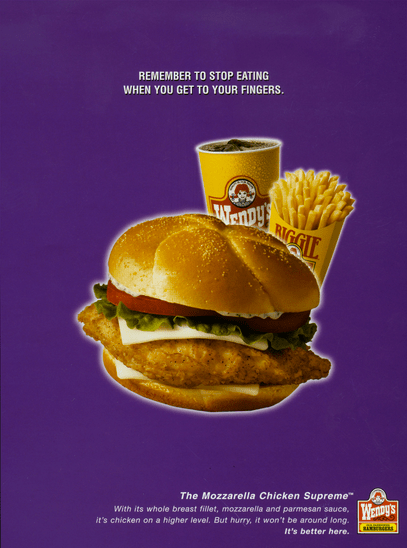
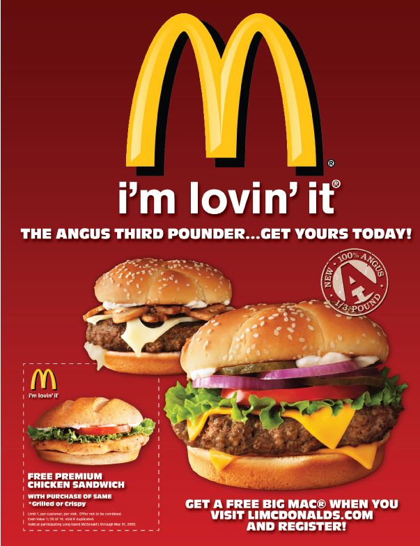
Objective: Create an original food advertisement design/illustration for an existing fast food restaurant. Directions:
Rubrics:
Timeline:
Tribal Art Design Tribal art is the visual arts and material culture of indigenous peoples. Also known as Ethnographic art, or, controversially, Primitive Art, tribal arts have historically been collected by Western anthropologists, private collectors, and museums, particularly ethnographic and natural history museums. Patterns Found in Nature New Guinea Art - Tribal Australian Patterns found in Nature Project Goal: Using an outline of an animal, insect or fish, fill the interior space with tribal patterns influenced by nature. Two variations of the same studies will be created. The first in black & white. The second in color. Directions:
Goal: Create a mock magazine layout consisting of a front and two connecting secondary pages. 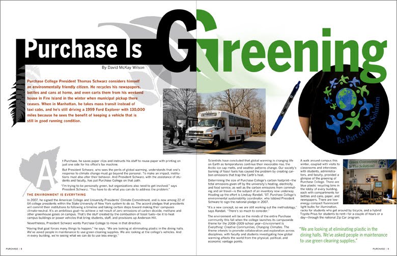 Directions: Create a mockup magazine cover and two page spread.
(1) Download and print out Grid Template. Create preliminary layout on printed grid template. (2) For the magazine cover layout, consider allocated space for a Masthead, Primary & Secondary content and Photos/graphics. (3) For two page layout, consider how many columns will be used, drop caps, Titles, pictures and captions. (4) Once layouts have been approved, define a subject for your project to drive the content needs. Use Greek Text to fill in paragraph information. Headers, Titles, Photographs & Graphics should all be subject specific. (Final work will be accomplished with Adobe Illustrator. Adobe Photoshop may be used to edit photos before importing to Adobe Illustrator. (5) Create original Drop Cap(s) & Logo/Masthead for final design. (6) Consider font choices. Font choices should enforce and empower design, not distract or water down design intentions. (7) Consider Visual Hierarchy as in terms of the order of importance that viewers should perceive information. Vocabulary Gutter (Ally): Blank space in the center where tw3o facing pages meet. See gutter margin Margin: The outside margin of a page, as opposed to the back (inside) margin or gutter. MastHead: A distinctive design, logotype, or style of type used to identify a company. Typically at the top of the layout / document. Font Familes (Serif vs. Sans Serif): Storefront Font: A decorative font designed to grab the viewers attention quickly. Effective for a few words. Not effective use of font display for paragraphs of text information. Text Wrap: Formatting - Text conforming to the outer contours of surrounding graphic information. Drop Cap: A single letter at the start of a body of text, designed to stand out and direct the viewers attention. Drop Caps are typically larger than other fonts on the page and tend to be embellished with non functional design detail. Visual Hierarchy: is the order in which the human eye perceives what it sees. This order is created by the visual contrast between forms in a field of perception. Objects with highest contrast to their surroundings are recognized first by the human mind. The term visual hierarchy is used most frequently in the discourse of the visual arts fields, notably so within the field of graphic design. Grid System: The most flexible foundation to support the designer working in two and three dimensions is that of the grid. The grid divides a two-dimensional or three-dimensional space into smaller compartments. The fields or compartments may be the same or different in size. (See grid designs below.) Columns: Vertical partitions of space used in design to organize graphic content. Greek Text: In publishing and graphic design, lorem ipsum is a placeholder text (filler text) commonly used to demonstrate the graphic elements of a document or visual presentation, such as font, typography, and layout, by removing the distraction of meaningful content. Borders: A part that forms the outer edge of something. A decorative lip that surrounds graphic elements such as text, photos and graphics. Banding: The presence or formation of visible stripes of contrasting color. Bleed: Is a printing term that refers to printing that goes beyond the edge of the sheet before trimming. In other words, the bleed is the area to be trimmed off. Language as we know today evolved from primitive symbols (cave paintings) and evolved into the modern language of symbols knowns as the alphabet. For this assignment you will be challenged to seperate your formalized understanding of language and consider the design qualities of fonts as it applies to the principles of design. Create six unique typography compositional studies, each reflecting one of the six principles of design. (See Design Terms Below) Principles of Design: (composition) 1. Contrast: Visual principle in which differences in light, values, texture, color, ect..create the illusion of depth within a two - or three - dimensional composition. 2. Rhythm: The visual progression of visual elements in a two-dimensional space; used to achieve perceptual movement. 3. Pattern: The combination of lines, shapes, and/or colors in a consistent, orderly or repetitive motif. 4. Unity: A repetition of units within a given frame which share a common denominator. 5. Balance: A state of equilibrium in which visual forces of equal strength pull in opposite directions. There are three types of balance: symmetrical, asymmetrical and radial. 6. Emphasis: A principle of visual perception that uses the elements of design to accent and direct visual attention. Rubrics:
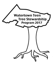
Project Critique Form: [Click here to view and print form] Teens for Trees Program for Watertown MA Logo Challenge!
Directions:
Example of thumbnail sketches: 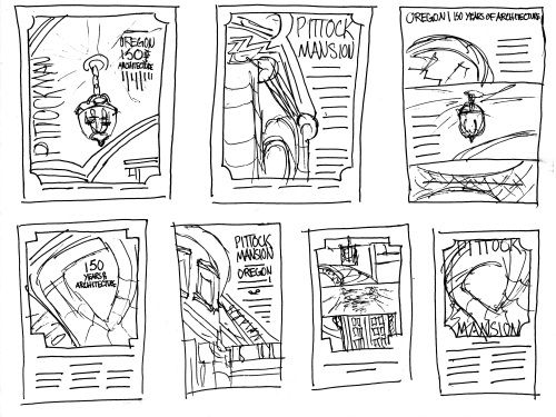 Goal: Create an original logo for a fictitious product. Directions:
Day of the Dead Sugar Skull Tradition |
|||||||||||||
| 91543680ce92e6c02d871118a7781bd5--skull-reference-reference-images.jpg |
Please email me with any questions regarding this assignment.
daniel.dressler@watertown.k12.ma.us
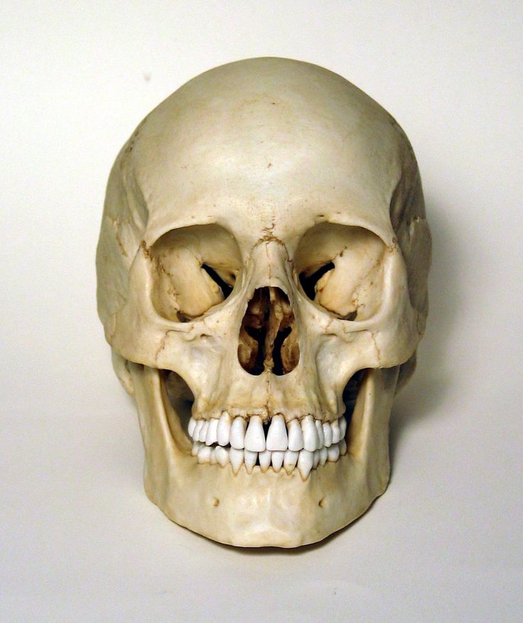
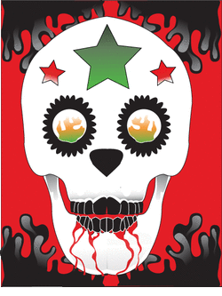
Project Goal: Design an original Sugar Skull.
Consider traditional and/or non traditional symbolism: Diamonds, Roses, Marigolds, Crosses, etc... Sugar skull will be symmetrical and utilize a limited color pallet of two analogous colors and one complimentary color.
Directions: Please keep two things in mind as you move forward with project: (1) Sugar skull should not look like a real anatomical skull. It should look more like a cartoon. See provided examples. (2) This project is about symmetry. You only need to draw half of everything! For example, draw one eye socket, copy, past, flip and align.
[Download Skull File Here]
Rubrics:
Media Literacy: Demonstrate understanding of Adobe Illustrator's Pen Tool, use of Anchor Points & Pathways, Color Gradients & Custom Clor Pallets.
Composition: Skull shape and interior design should be symmetrical.
Use of Color: Work within a limited color pallet when making color decisions.
Symbols: Creative use of symbols and design embellishments within the interior and exterior of the skull form.
Framework Standards:
Methods, Materials, and Techniques
Students will demonstrate knowledge of the methods, materials, and
techniques unique to the visual arts.
Elements and Principles of Design
Students will demonstrate knowledge of the
elements and principles of design.
Observation, Abstraction, Invention, and Expression
Students will demonstrate their powers of observation, abstraction,
invention, and expression in a variety of media, materials, and
techniques.
daniel.dressler@watertown.k12.ma.us
Project Goal: Design an original Sugar Skull.
Consider traditional and/or non traditional symbolism: Diamonds, Roses, Marigolds, Crosses, etc... Sugar skull will be symmetrical and utilize a limited color pallet of two analogous colors and one complimentary color.
Directions: Please keep two things in mind as you move forward with project: (1) Sugar skull should not look like a real anatomical skull. It should look more like a cartoon. See provided examples. (2) This project is about symmetry. You only need to draw half of everything! For example, draw one eye socket, copy, past, flip and align.
- Download image of human skull found on this web page and lock it down as a template.
- Make a new layer over the template layer. Using Adobe Illustrator draw half of the skull shape. Either the left or right side. Copy and paste drawing. ( "command + C" to copy / "command + V" to paste). Flip the coppied half with the "Reflection Tool".
- Align the anchor points with each half of the drawing. Using the White Anchor Point tool, hold down the shift key and select each ending anchor point of the opposing sides. Then go Object > Path > Join.
- Break up the skull into seperate layers. The jaw should be the bottom layer. The crown should be the overlapping top layer. Additional layers should be created for the teeth, eyes and nose socket. Additional layers should be created for the design elements.
- Embellish the interior of Sugar Skull drawing with symbols /designs. Like the Sugar Skull, your designs should be Symmetrical. Review the link on this web page that discusses the origins of the Sugar Skull (Day of the Dead). Consider symbolism for your sugar skull. What do you want to convey in your design. Do you want to make traditional religious symbols? Maybe more contemporary such as diamond shapes. Or relating to sports, music, popular culture, etc.
- Embellish the exterior of sugar skull. You are required to have two external shapes around each opposing side of the skull. Traditionally roses would go there. But again, your skull does not need to be traditional. Remember, which ever you illustrate, you only need to create one! Then copy, paste and flip.
- When coloring Sugar Skull pre-select two Analogous colors along with one Complimentary color. To create more variety of color use the Color Guide Pallet to create tints and shades of color swatches. Once new color pallet as been made, save for future use.
[Download Skull File Here]
Rubrics:
Media Literacy: Demonstrate understanding of Adobe Illustrator's Pen Tool, use of Anchor Points & Pathways, Color Gradients & Custom Clor Pallets.
Composition: Skull shape and interior design should be symmetrical.
Use of Color: Work within a limited color pallet when making color decisions.
Symbols: Creative use of symbols and design embellishments within the interior and exterior of the skull form.
Framework Standards:
Methods, Materials, and Techniques
Students will demonstrate knowledge of the methods, materials, and
techniques unique to the visual arts.
Elements and Principles of Design
Students will demonstrate knowledge of the
elements and principles of design.
Observation, Abstraction, Invention, and Expression
Students will demonstrate their powers of observation, abstraction,
invention, and expression in a variety of media, materials, and
techniques.
The Rubber Ducky Project
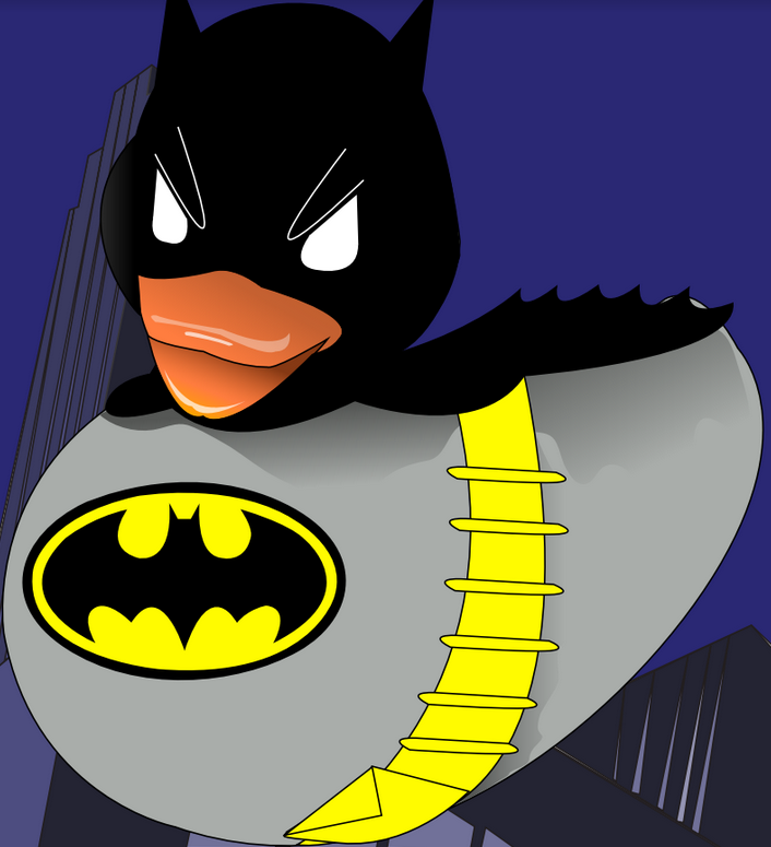
| Project Objective: An introduction to the basics of Adobe Illustrator. During this lesson you will be challenged to (1) recreate a photograph of a rubber duck into a vector image and (2) transform the duck image by injecting satire and personality into the form and its surrounding spaces. Directions: (Instructions are general. See instructor for more specific detailed instructions)
Rubrics:
| ||
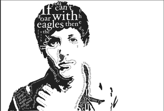
Objective: Illustrate a portrait of a person of interest. Incorporate typography within the positive and negative areas of the imagery. Consider font faces that relates to the personality and the historical period of the person being illustrated.
Directions:
1. Select a person of interest (Musician, Athlete, Actor, Poet, etc...)
2. Import image into Adobe Photoshop. Go Image > Adjust > Threshold.
3. Save file as a .jpg and import into Adobe Illustrator. Illustrator document should be 17'x11' or 11"x17".
4. Make the imported image a template. Lock down image and create new layers in the layer pallet.
5. Trace out portrait image. Discard original image which is on the template layer.
6. Go to dafont.com and download an appropriate font face that reflects both the personality and historical era of the person being illustrated.
7. Research the person being illustrated. Utilize quotes, song lyrics, etc, that person of interest is know for saying.
7. Incorporate text passages within the positive and negative spaces of your illustration.
8. Convert text to outlines once placed on document.
9. Consider a variety of techniques when placing typography such as (1) Type on a path tool, (2) Variety of size to promote voice inflection and visual hierarchy, (3) Pathfinder to create cropping, etc.......
10. When composing composition, consider the elements of design.
Rubrics:
1. Effective rendering of portrait. Illustrated portrait resembles original photo.
2. Font face(s) successfully reflects the personality and historical period of the person being illustrated.
3. Typography has been incorporated into the positive and negative areas surrounding the illustrated portrait.
4. A variety of techniques was explored when incorporating typography.
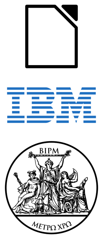
Project Goal:
Recreate pre-existing logo so as to interject humor and satire into the images/text. The final product should maintain logo recognition while striking a balance with humor. (See examples below)
Directions:
(1) Research published logos - ideograms. Select one to redesign.
(2) Recreate the message. For example: Bed, Bath & Beyond could turn into Bed Bugs & Beyond.
(3) Research font used in original logo. Use the same font in your own work if possible, or at the very least a font that closely resembles the font being used. Check out sites like www.dafont.com to download free fonts.
(4) Use the same color schematic as found on the original logo. Employ the Eye Dropper Tool in Illustrator to the get the exact color profile.
(5) When creating illustrations for your revised logo, strike a balance between the original imagery and that of your imagination.
Rubrics:
- Revised logo should maintain logo recognition.
- Font face should be the same and/or similar to original logo.
- Color schematics should be similar to original logo.
- Revised logo should demonstrate humor and satire.
- Word Generator: Thesaures.com
- Rhyme Zone: http://www.rhymezone.com/
- Download Fonts: Dafont.com