Dan Dressler
  • Home
  • My Work
    • 2022
    • 2021
    • Fall_2019
    • Summer_2019
    • Beneath the Surface
    • Multi Media Collage
    • Photography
    • Drawings
    • Mono Prints
    • Acrylic
  • Contact

Visual Art 2D Projects

Monochromatic Acrylic Still Life - Tinting & Shading of Color

12/12/2018

 
Project Goal:  Using critical observation paint a grayscale monochromatic still life. Once the three tonality system has been addressed, apply thin translucent layers of paint over the surface to create optical blending (tinting & shading).

Directions:
  1. Select a photographic image from the internet of simple fruit or other still life.  Make a B&W printout to reference.  Save the original color file to your email. Eventually you will be using your laptop to reference color file.  
  2. Prime canvas by applying a ground.  Establish local tones to establish future layers of paint on top of.  
  3. Next, begin painting the forms.  Start by blending paint on your palate to establish grey tones that match up with your subject matter.  
  4. While the paint is malleable, blend tones to create smooth gradient transitions.
  5. Once the grayscale rendering is complete, apply thin translucent washes of colored acrylic paint over the surface of painting.  This will result in optical blending (tinting and shading of color).
  6. Once painting is complete, apply a thin varnish over the surface to complete project.


Rubrics:
  1. Critical Observation: Painted forms resembles reference photo.
  2. 3 Tonal System: Final grayscale painting demonstrates ranges of tone from pure white, to grey and pure black resulting in contrast and pictorial space.
  3. Glazing: Evidence of translucent color glazing resulting in tinting and shading of color.
  4. Craft: Final work demonstrates control of brush. Crisp clean edges.  Smooth even gradient transitions and even applications of paint. ​


Video Demo on Tinting and Shading of Color
www.youtube.com/watch?v=33_OjNxC15k
Picture
Picture
Picture
Vocabulary Terms for 2D Visual Art Acrylic Painting Project

  1. Tinting & Shading: Adding white to color produces tinting. Adding black to a color produces shading.
  2. Tonality: The color scheme or range of tones used in a picture.
  3. Figure Ground: The initial layer or surface of the painting which serves as a barrier between the canvas and the paint.  
  4. Opaque: An application of media that completely covers the surface below.
  5. Translucent: An application of media that allows the color below to see through.
  6. Blending: The process of mixing adjacent colors to eliminate abrupt divisions and create a smooth gradation from one color to the next.
  7. Glazing: Is the process of layering thin transparencies of paint. It creates luminous effects because light can pass through them and reflect back from the surface of the painting.
  8. Matte: A dull surface as opposed a shiny surface.

Critical Observation Study

10/11/2018

 
Picture

Three Tonality India Ink Rendering

9/27/2018

 
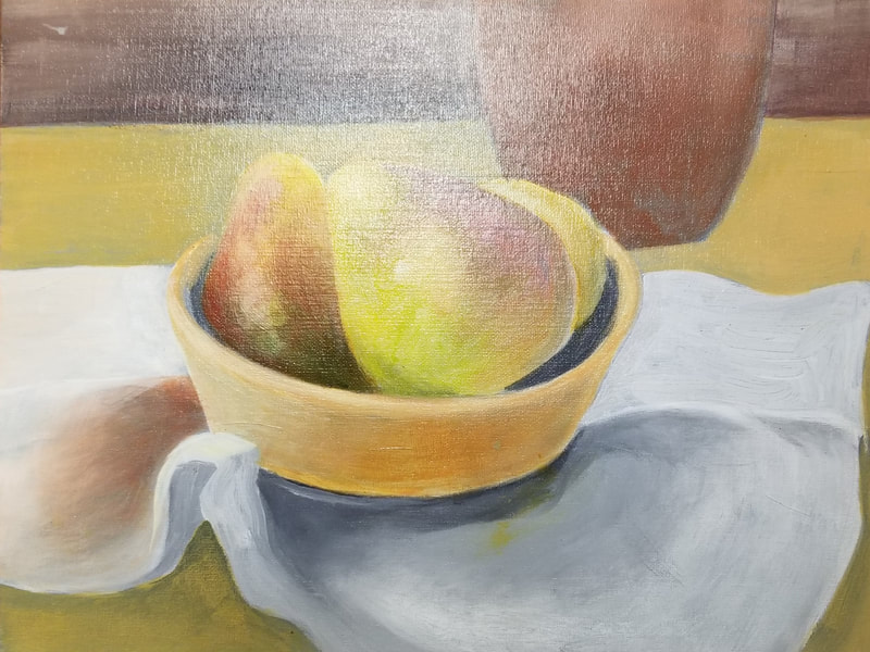
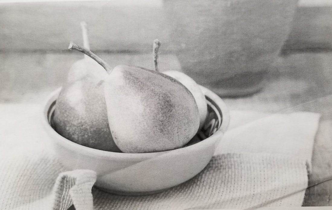
Project Goal: Create a rendering of translucent bottles while utilizing the Three Tonality System. 
Directions: Working form a still life or photographic reference, create a pen and ink rendering that demonstrates pure whites, midtones and pure blacks to promote contrast and the illusion of space on a flat surface. 
  1. Stretch a sheet of watercolor paper.
  2. Using a pencil, create a light line drawing of bottles.
  3. Using Brush and India Ink, carefully match up the tones as displayed in still life or photographic reference. Carefully render image.
  4. Preserve white spaces on the canvas to maintain highlights. 
Rubrics: 
  1. Craft: Clean, consistent and controlled applications of ink.
  2. Tonality: Evidence of three or more tones working together to achieve contrast.
  3. Highlights: Evidence of highlights (preservation of white spaces on paper)
  4. Proportion: Bottle shapes are proportionate to one another. Accurate use of contour lines. 

Watercolor Landscape Painting

9/27/2018

 
Project Goal: To create a watercolor landscape that demonstrates knowledge of over (1) watercolor technique, (2) color theory and (3) Atmospheric Perspective. 
Directions  (Part 1):
  1. Stretch watercolor paper.
  2. Establish color pallet.  For the first study we will use 1 primary, 1 complimentary and the color black.  For the second study our color pallet will be open ended.  Meaning you are free to experiment with a range of colors. 
  3. Begin your painting with the Wet on Wet technique.  Establish a soft focus blurring effect of blending colors while using a flat brush.  Your initial application of color should be light in value.
  4. Allow the first application of color to fully dry.  Next, glaze a new application of color over the previous.  Each consecutive glaze should get darker while gradually establishing contrast. 
  5. Towards the end of the project start using your round brush for smaller details such as water ripples, tree branches, etc.  The final application of color should be at its strongest range of vaule.
Rubrics:
  1. Glazing: Final product should demonstrate multiple applications of glazing.
  2. Atmospheric Perspective: Final product should demonstrate a range of values/contrast to establish the illusion of space.
  3. Overlapping Shapes: Demonstrate multiple layers of overlapping forms.
  4. Hue/Saturation: Hue and Saturation should be greyed out in the background and gradually strengthened as forms approach the foreground.
  5. Diminishing size: Shapes such as trees should gradually get smaller as they reach into the background.
Picture
Atmospheric-Perspective: a technique of rendering depth or distance in painting by modifying the tone or hue and distinctness ofobjects perceived as receding from the picture plane, especially by reducing distinctive local colors andcontrasts of light and dark to a uniform light bluish-gray color.

1. Overlapping shapes
2. Objects getting smaller as they approach the background
3. Diminishing detail and color saturation

Color Theory:
1. Primary Colors
2. Secondary Colors
3. Complementary Colors
4. Analogous Colors
5. Hue
6. Saturation of Color
7. Tinting and Shading of Color
Materials:
1. Watercolor Paper: (a) Hot vrs Cold Press (b) Paper Weight
2. Types of Watercolor Paint
3. Types of Watercolor Brushes
Watercolor Techniques:
1. Wet on Wet
2. Wet on Dry
3. Preserving White Space of Paper

​
Evaluation Form for Watercolor Project
[click here for document link]

Exercise 7: One Point Perspective Room

9/5/2018

 
The most common perspective drawing lesson is a one point perspective room. Interiors combine a multitude of skills and can be made as challenging or involved as required. Perspective flooring allows you to practise dividing surfaces into equal spaces, while the questions of how to draw a window in perspective; furniture / desks / beds; or adjoining corridors etc provide a challenge regardless of your ability level. To gain ideas about how you might approach drawing interiors in perspective, we have included a range of examples below, including bedrooms, living rooms, kitchens and hallways. Drawing a room in one point perspective can be great practise for those who wish to later pursue interior design, architecture or for those who are studying Design Technology at high school.
Picture
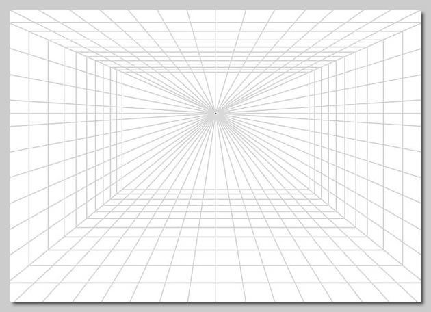
The illustration above shows a one point perspective grid (this may be downloaded and printed for classroom use) which may be drawn on directly or traced over, using a lightbox.
To understand how to draw a room in one point perspective, please view our step-by-step video:
Picture
Picture
Picture
Picture

Exercise 6: Circles & Curves

9/5/2018

 
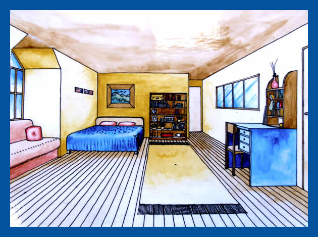
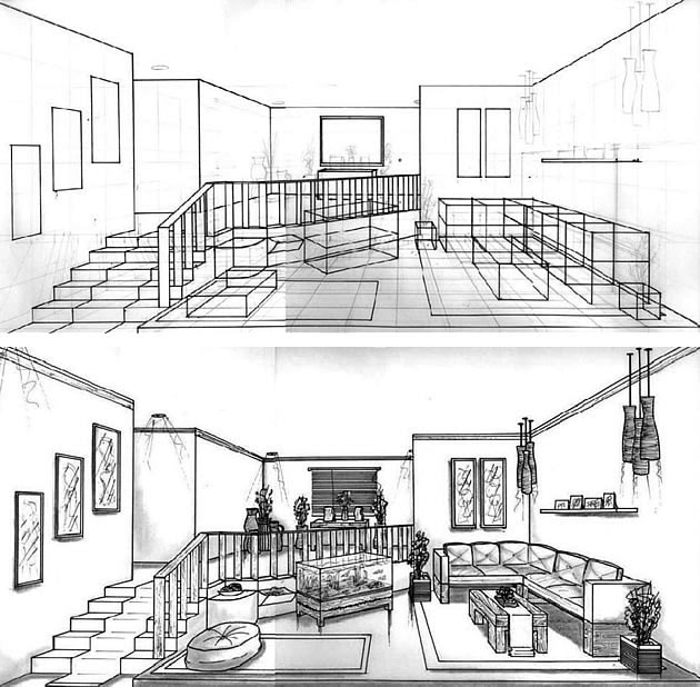
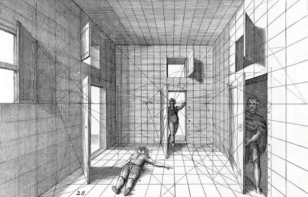
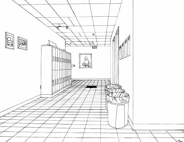
The most challenging aspect of perspective is drawing curving or circular forms. These are typically sketched freehand, inside squares or rectangles to help get proportions correct.
By the completion of this exercise, you should be able to:
  • Use the technique of ‘crating’ – drawing complex forms inside rectangular boxes
  • Draw circles, cylinders and cones in one point perspective, from a range of different angles
  • Use straight lines (guidelines) to aid the drawing of irregular curves, such as the curving forms of rivers or trees in a one point perspective landscape
  • Understand that:
    • Circles or curving forms that face the viewer are drawn using their true shape
    • Circles that recede towards the vanishing point appear distorted, appearing smaller as they get further away

​These concepts are explained in the following video:

Exercise 5: One Point Perspective Cityscape

9/5/2018

 
Drawing a road and surrounding cityscape (either imagined or observed from real life) is a great follow-up activity to the previous exercises. A one point perspective street scene typically combines repetitive manmade elements with stacked, cut and angular forms. This exercise can be as challenging or minimal as desired, allowing able students to move ahead and produce detailed, elaborate drawings.
Picture
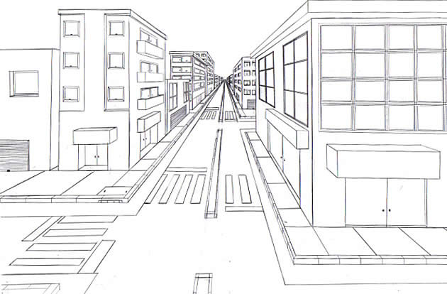
​This is a good example of how to draw a road in perspective, with basic rectangular blocks modified to create a city scene.
Picture
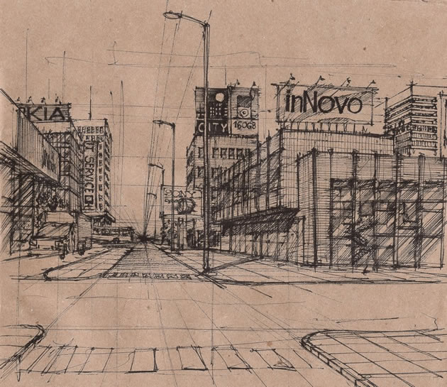
One point perspective drawings are often dry and analytical. Once mastered, however, knowledge of perspective can be used to create rich, expressive observational drawings, such as this cityscape drawn using black biro pen on brown paper.

Exercise 4: Finding Centers & Equal Spaces

9/5/2018

 
This video explains how to equally divide items in one point perspective, allowing you to draw fence posts, lamp posts, and equally spaced windows or buildings.
By the completion of this exercise, you should be able to:
  • Find the centre of any rectangular surface using the ‘corner to corner’ method (this works even on surfaces that are receding towards the vanishing point)
  • Divide the surface of any rectangular block into any number of equal parts
  • Draw tiles on a floor in one point perspective
  • Draw repeating elements, such as fence posts, receding into the distance

​This is explained in the following video tutorial:

Exercise 3: Perspective Block Letters

9/5/2018

 
Drawing block lettering in one point perspective is a relatively straight-forward task, suitable for a homework activity.

The following video demonstrates how to do this:

Exercise 2: Stacking, Holes & Angles

9/5/2018

 
Picture
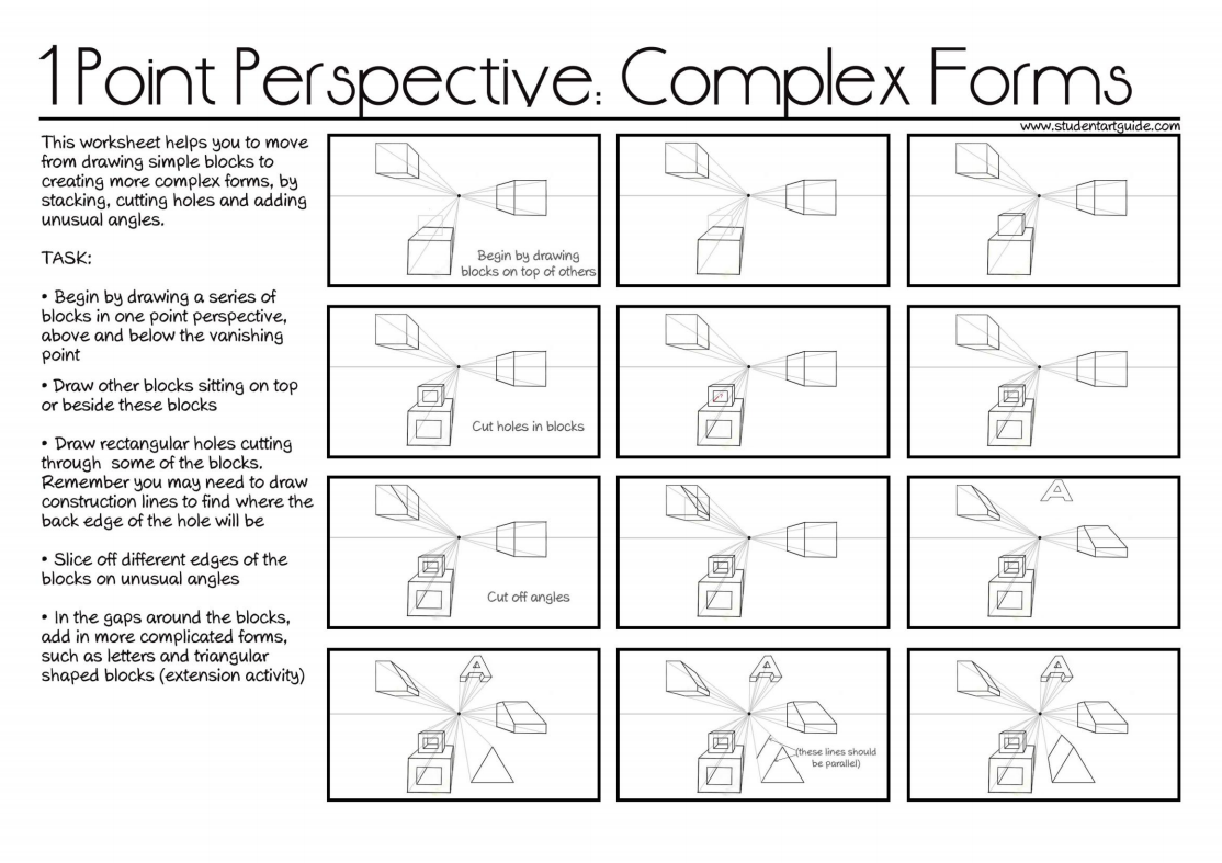
This worksheet illustrates how to stack blocks, cut away portions and add unusual angles in a one point perspective drawing, creating gradually more complex forms.
By the completion of this exercise, you should be able to:
  • Draw stacked blocks of different sizes
  • Draw blocks that have holes cut out of them, projecting construction lines to find the back edge of the cut area
  • Slice pieces off blocks and/or add unusual angles
Once you feel confident with drawing these items, you may wish to add more challenging forms, such as letters and/or triangular shaped prisms.
The following video helps to explain how to draw one point perspective drawing step-by-step:
<<Previous

Visual Art by Dan dressler

Contact Information

Dan R. Dressler
​Waltham, MA 02453
visualart@dandressler.com
  • Home
  • My Work
    • 2022
    • 2021
    • Fall_2019
    • Summer_2019
    • Beneath the Surface
    • Multi Media Collage
    • Photography
    • Drawings
    • Mono Prints
    • Acrylic
  • Contact